Starting A New Icon - Selecting A Board And Design
Would you like to paint a Byzantine icon? Follow these technical pages to learn how! Allow yourself plenty of time, at least 40 meditative hours. Although you can paint an icon in five or six intensive days (as at a workshop), a slower pace and shorter work periods of 2 to 4 hours suit me better, and allow the egg tempera paint to set up between layers.
There are many other traditional and modern techniques and styles for painting an icon, and some are quicker, but this one produces especially beautiful results.
Select an icon you would like to paint. If this is your first icon, choose a half-figure (waist up) or head of a saint or angel. You will need a pattern drawing, such as the one shown above - available from teachers and books. You can xerox a design from a book, card, or calendar (preferably in color) and use that as a pattern. A web search will turn up more images. If you are painting a modern saint, use a cherished photograph. Both eyes and at least one ear should be visible, and mouth should be closed, typically with neutral expression or a very slight smile.
Refine the drawing if necessary. You may re-draw the pattern, making small or larger improvements. Some drawings are beautifully crafted and designed for student use; others are confusing or incomplete, and may require considerable re-working. With experience in the Byzantine icon style, you can draw your own pattern freehand. Take the time and care to make your design just as you would like it; it will be much easier to fix it now than later. Give particular attention to gesture, facial expression, and the draping of the garments.
For guidance in highlighting, garments should have a typical branching pattern of folds and wrinkles, without stray lines; so draw in those fold patterns. (Some patterns have closely spaced hatch marks to indicate highlighting on the garments; delete those from your drawing.) Mark the borders of each color area, such as the edge where the outer garment overlaps the inner, and where the throat meets the neckline, which may be ambiguous on some drawings.
Select a board or panel of proportions to fit your pattern. (See below). For your first icon, select a board or panel in the size range from 7 x 9 inches to 11 x 14 inches.
Unwrap your board. Which way is up? Try balancing the board first on one end, then on the other. If it balances better on one end, that is the most solid base.
Xerox the drawing to the correct size for the board. When properly sized, the top of the saint's head should come exactly to the top of the flat part of the recess ("kovcheg," "covcheg," or "ark") in a sculpted board, without cutting off any lower parts of the drawing.
On a flat panel, position the figure in such a way as to leave 3/8 to 5/8 inch between the top of the halo and the top of the panel. Allow some space at sides and bottom for a border; do not cut off the image at sides or bottom.
Draw guide lines, using a ruler and a light pencil line. I prefer a "non-photo blue" pencil. Draw a line on each side, a scant 1/8 inch in from the edge, the limit for the red clay bole that covers the edge.
If you want a wide border in a contrasting color, draw guide lines to delineate its edges. On a sculpted board, the border will come to the outer edge of the recess (Kovcheg, covcheg, or "ark"). On a flat panel, you have more choice; the border may be the same width all around, or top and bottom borders may be wider than side borders. Extend these light guide lines to the edge of the board.
If using a recessed board, extend light pencil lines marking both inner and outer edges of the recess, out to edge of board.
For an icon with a symmetrical composition, measure and draw a vertical line down the center of the entire board, top to bottom. On your Xerox drawing, draw a corresponding vertical line. The center of the halo should lie on this line.
Carefully position the drawing on the board. If necessary, trim edges of the drawing. Draw guide lines corresponding to the guide lines on your board.
Using a compass with pencil tip, verify that there is room for the halo. On many drawings, the center of the halo is marked by an "X." If not, you may need to establish this important point by trial and error. It's usually at eyebrow level.
When satisfied with the position of the drawing, tape down both top corners and one bottom corner. Slide a piece of carbon paper underneath, shiny side down. Carefully trace with a ball point pen - not too heavy! Start with the eyes, then complete face and hair, and work outward through the hands, garments, books and scrolls. Mark the center of the halo with an "X." Do not trace halo, lettering, spears, globes, tiny details, or hatch marks used on some patterns to indicate highlights.
Lift the bottom corner, to verify that you didn't miss anything!
When complete, use a compass with pencil tip to draw the edge of the halo. Finding the best radius may require trial and error. Before gilding, this area will be covered with red clay bole.
Selecting The Right Board Or Panel For Your Icon
Typical beginner icons, showing a figure from the waist area up, or just head and shoulders, are of a proportion which will almost always fit attractively on boards and panels of the standard sizes 7 x 9 inches, 9 x 12 inches, 9.5 x 12.5 inches, 11 x 14 inches. If the icon is symmetrical in composition, it will generally also fit on an arched board of these proportions. You will usually have to xerox your drawing larger or smaller.
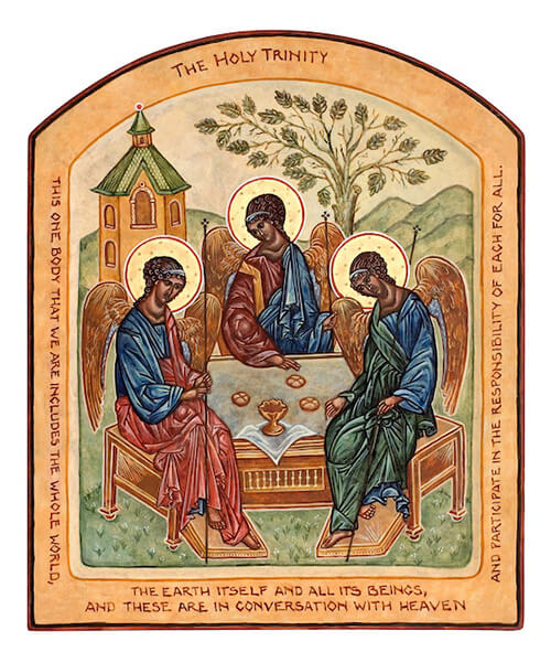
Some icons require boards or panels of other proportions. The Trinity icon is proportioned 4 units wide to 5 units high. A tall narrow board accommodates a standing figure. Some icons are intended for a square or near-square board, and a few for a horizontally oriented board. To realize your vision, you may choose to order a custom board. If you have a well-equipped wood shop, including a router, and are willing to gesso your own boards or panels, you may prefer to make your own custom boards or panels.
For any icon, you will probably make some minor adjustments to the drawing, so that it will look good on its board.
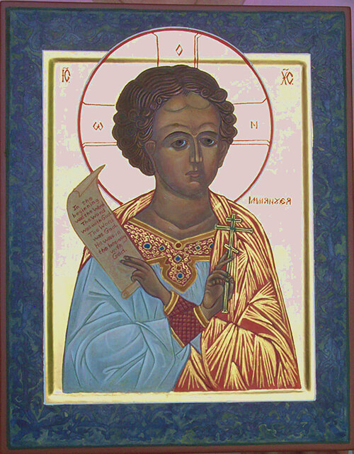
The same icon drawing; two boards and two interpretations!
These icons of Christ Emmanuel were painted side by side in the same Prosopon School workshop, using the same drawing.
Left; by Loretta Hoffmann, on a sculpted board 11 x 14 inches, with gilded background and patterned dark blue border.
Right, by Betsy Porter, on an arched panel 9.5 x 12.5 inches, with night sky background and a plain narrow border.
A Problematic Choice Of Board
Both of the icons at right were painted on standard sculpted boards, 11 x 14 inches with recess or kovcheg. The wide margin is designed to provide space for a half-figure whose halo extends well onto the margin.
In these icons, the image is constricted within the recessed area, so the margin appears disproportionately large. On the Mandylion icon at far right, a reddish outer border was added to reduce the apparent size of the board. A decorative line with corner motifs similarly softens the impact of the wide margin of the Annunciation icon at near right.
Both icons would have looked better on custom boards with narrower borders and proportionally larger kovcheg. As a second choice, a flat panel would have provided more space for the image.
Before applying bole, lightly engrave the main lines (and especially the facial features) into the white gesso with a pointed tool. This will help you locate the features under the dark base color (roskrish) to follow. Do not engrave archangel’s spears, stars, fringes, lettering, small details, or transparent globes. Wipe up dust with a tissue.
Engrave lines where gold leaf meets the image. After establishing the exact location of the halo line, you may optionally engrave that too. For a gilded background, engrave around the edge where gold meets the board.
With increased experience, you may prefer to paint some lines rather than engraving them. Dark brown such as burnt umber is a good color. Some iconographers prefer India ink, diluted with 10 to 20 parts water to one part ink. Painted lines should be just dark enough to show through overlying roskrish paint.
When engraving is complete, use a kneaded gray rubber eraser to lighten the dark lines from the carbon paper, and to clean up stray guidelines.
Selecting Colors For Your Icon
Consider the main colors for your icon. What color garments will the saint wear? For well-known and Biblical saints, there are traditional colors, which can be found in historic icons or reference books - but you will see considerable variation in the depth, intensity, and shade of these colors.
Icon colors tend to be earthy and natural, with bright colors used only selectively. The base coat for the figures will be dark and muted. Through a series of increasingly brighter highlights and floats, you will symbolically bring order out of chaos, light out of darkness, and sparkle out of shadow.
Garment colors are symbolic; it is said that the color of the outer garment indicates the public persona or life story of the saint, and the inner garment signifies more private or personal qualities. Martyrs are usually shown with a bright red outer garment.
Also think about the background color or colors. Many traditional icons have gilded backgrounds to evoke the brilliance of heaven. A pale golden yellow provides much the same effect. A deep blue night sky with stars makes a heavenly background for Christ in Glory. In historic icons, you will see a variety of background and margin colors. Almost any color may be used, other than stark white or black, which are too harsh to properly set off the subtle tonalities of natural pigments.
I like to use a contrasting margin to frame the image, but this is entirely optional. The margin color is typically a darker and toned-down version of the color used for the inner background. If in doubt, a dark gold outer margin looks good with most inner backgrounds. Margin and background should not distract from the main figure.
Forward to Color Recipes
Select a pattern drawing if you don't already have one
When layout is complete, your icon is ready for (optional) Gilding
Back to Home Page
Back to Main Technical Page


