BEGINNING TO PAINT YOUR ICON; SANKIR and ROSKRISH
Byzantine icons are painted using a structured and somewhat ritualized protocol, using a series of symbolic steps, each of which will take an hour or so, for a total of at least 40 hours. If you haven't tried it, this may sound foolish - won't it inhibit your creativity to work so slowly and deliberately? Can you work with a historic image and still be creative?
In my experience, this method can enable almost any motivated adult to produce a beautiful icon, and the technique forms a steady foundation for further development of one's artistic abilities. Many artistic decisions are required. Your unique inner creativity will shine through!
This artistic approach may seem counter-intuitive, especially if you are accustomed to working in watercolor technique, dark over light, darkening the shadowed areas and leaving the brighter areas white or only lightly painted. With this more familiar approach, the artist strives to get it right the first time, and to develop those perfect, expressive, spontaneous- looking brush strokes, because mistakes can be hard to fix.
An icon is painted the other way around, starting with application of dark shadow colors in minimalist brush strokes, and gradually adding layers of highlights and transparent color. This egg tempera technique produces colors of great subtlety and luminosity, set off by deep shadows. The resulting artistic effect is rich and intense. Egg tempera paint can be easily removed while fresh; but once it sets up you can paint right over it; so small changes are relatively easy.
There are many methods and styles by which an icon can be painted. The following directions describe (with slight modifications) the Prosopon Method developed by my first teacher, Vladislav Andrejev.
See Color Recipes for instructions on mixing the colors recommended below.
Before applying bole, lightly engrave the main lines (and especially the facial features) into the white gesso with a pointed tool. Do not engrave staffs or spears, stars, fringes, lettering, small details, translucent bottles, or transparent globes. Engrave lines where gilding meets the board, but not until you have established your halo line by trial and error. Wipe up dust with a tissue; don't blow it around.
When engraving is complete, use a kneaded gray rubber eraser to lighten any dark lines remaining from the carbon paper used for tracing the icon drawing, and to clean up stray guidelines.
With experience, you may prefer to paint some or all lines rather than engraving. Use a color just dark enough to show through each roskrish color.
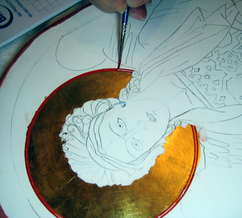
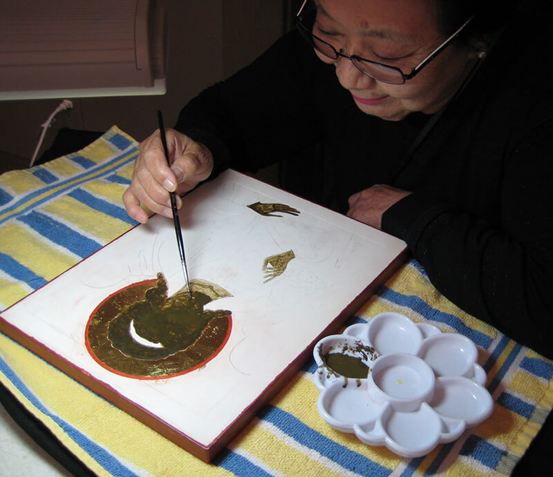
After gilding, first apply a bright red line in a circle at the edge of the halo. Carefully locate the center of the halo, often marked by an “X” on the drawing. Using a compass with a ruling pen tip, open the compass to the radius of the halo. Fill the ruling pen with liquid red paint. Practice on paper. Holding the ruling pen at a slant, apply a thin red circle just at the edge of the gold leaf, overlapping the gold slightly. (If you have difficulty getting paint to stick to gold leaf, add a drop of hide glue.) Now widen the compass slightly, and paint another concentric circle in the same color farther out, leaving 1/16 inch between lines. Fill in between the lines with the same color, using a small brush. Black or dark red may be used instead of bright red. If your subject is Christ, paint the cross and symbolic letters in his halo.
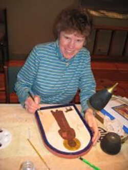
Filling in with red paint between concentric red lines around the gilded halo. For a small halo, do not use a ruling pen compass, but lay out the circle with a template and paint freehand. If you don't have a ruling pen compass, draw light concentric guide lines with a pencil tip compass, and paint the red halo circle freehand.
Icons are painted with a distinctive brush stroke, which may be quite different from brush work you have learned elsewhere. In solid areas, mop on paint for roskrish and floats with a wet brush. Hold the brush on a slant and work quickly in little circles, 1/8 to 1/4 inch, barely touching the board with your brush. Do not dab, and do not lift the brush from the board until you need to refill it. Keep it wet and keep it moving, carrying pigment across the area. The paint will form a puddle, but it won't take long to dry. Avoid long brush strokes. This "petit lac" (little lake) method actually covers the area quite rapidly, and results in a subtle mottled texture. Cultivate a light touch and a sense of the paint as a veil. A long wide brush stroke is considered the narcissistic "mark of the artist," and unbecoming to an iconographer.
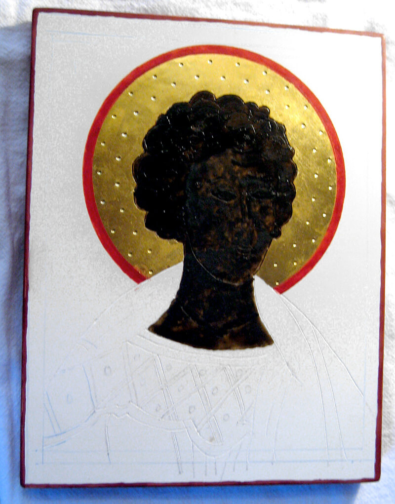
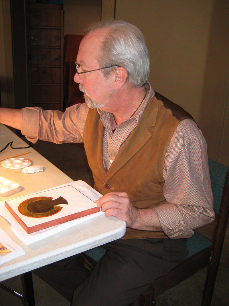
Randy Bowman is painting the head of Saint Stephen. He has completed the gilding and has impressed a design in the gold leaf, has painted the red line around the halo, and is now applying sankir to face, hair and throat.
A closeup shows the lightly mottled effect produced by moving the wet brush in tiny circles. Note that the eye sockets and other shadowed areas have an extra coat of sankir, making the features easier to locate through the nearly-opaque paint.
During the next session, Randy paints the remaining roskrish colors and a basic light gold background color.
The color for the red outer garment is quite light and may need an additional coat to set off its highlights.
Next time, Randy darkens the red roskrish, and then paints in the dark lines. His icon is now ready for highlighting.
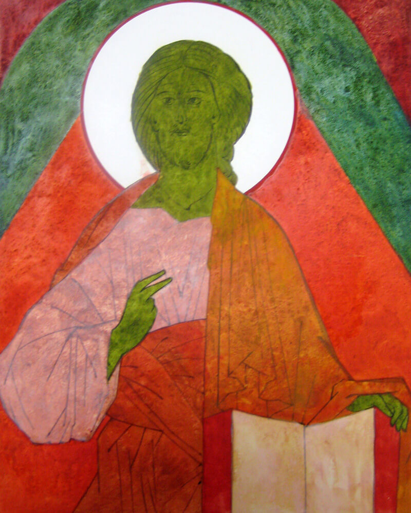
ROSKRISH (also spelled roskrysh) or base colors come next. Roskrish colors are dark and muted, and will remain as shadows throughout the painting process. They represent the “chaos” or primordial energy of the universe - an energy which persists in the finished piece, like the background radiation from the Big Bang. Roskrish colors are applied, like other solid color areas, in tiny circular strokes with a wet brush, resulting in a mottled texture with a hint of the white board showing through.
Sankir (also spelled sanquir), typically a dark olive drab, is the base color for flesh and hair areas. Apply the paint full strength and fairly opaque, with a hint of white coming through. Mix paint no thicker than light cream, for a good brush feel. To ensure good shadows on the face and throat, first paint in the shadowed areas including the entire eye sockets, around the hair line, down both sides of the nose, a spot between the bottom of the lower lip and the top of the chin, and the shadow on the throat under the jaw. Now paint all flesh and hair with sankir – right over the eyes and other features. Don’t forget hands, feet, and throat! You may need a second coat for good coverage. Leave angel’s hair band unpainted.
Next, apply roskrish colors for the garments and angel wings. Each paint mix should typically contain a gritty pigment for texture and character. Dilute paint with distilled water, about one part water to two parts paint. Proportion may vary with pigment, so test on white paper.
To avoid smearing, work from inner areas out toward the edge. Work to a wet edge, using small circular strokes by a wet brush held at a slant, spreading pigments around in wet paint for that uniformly mottled “chaos” look. More than a hint of white should show through. A large garment may be divided into smaller areas for easier painting. Work for consistent color and coverage, spreading the texture pigment around. If your texture pigment runs low in the palette cup, add just a smidgeon more. Apply one or two coats of roskrish as required for coverage. Second coat may be a slightly different color and thinner than the first coat. Texture pigment may be omitted from second coat if you wish.
When roskrish for the figure is complete, paint in the basic background color, usually light gold. Dilute with about 1 part water to 2 parts paint. You may find it difficult to keep your paint mix consistent over the large background area, because some pigments (usually texture pigments) are used up more quickly than others. To avoid this, start painting in the narrowest place, typically just above the halo, and spread some background paint lightly backwards for a gradual start. Add small amounts of the missing pigment to your paint as you progress.
Note the lightness and translucency of his technique. Lines were painted before applying roskrish.
Dmitri prefers a decidedly greenish sankir mix. The white inner garment has a different roskrish mix from the white parchment pages of the book.
The red-orange outer garment will eventually receive highlights of gold leaf. This is a different mix from the bright red of the inner background, and yet different from the wine red in the corners.
After base colors are dry, you may find that the surface has more texture, or less consistent texture, than you like. You can very lightly scrape the paint surface with the edge of a small palette knife, reducing the height of the largest particles. Don't dig into the white gesso! Or wipe the icon gently with a paper towel, to remove excess grit. Wipe from lighter areas toward darker colors, in order to avoid spreading dark pigments on light colors.
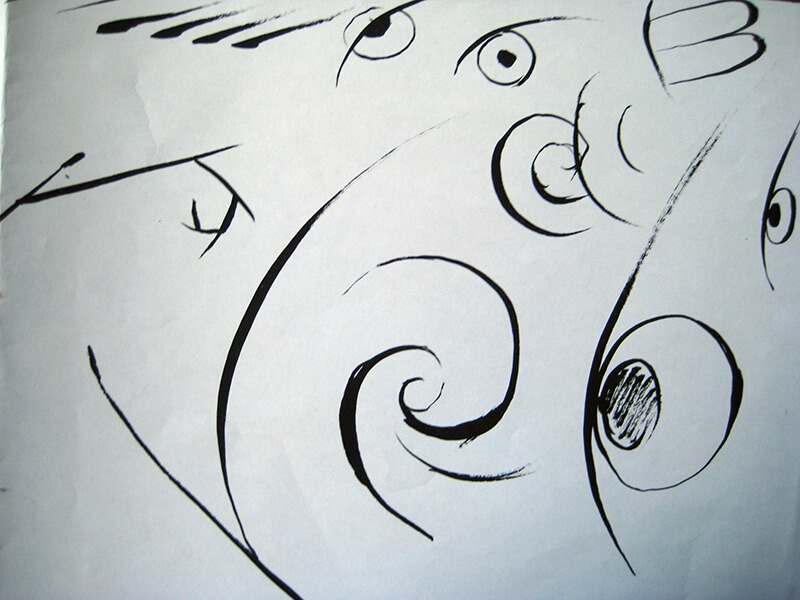
LINE WORK – Practice first on paper for at least 10 minutes! With your small round brush, paint straight lines, circles, arcs, spirals, eyes. Paint lines thin-to-thick, thick-to-thin, thin-to-thick-to-thin.
Now paint and refine the lines of your icon with your smallest brush. Use your paper drawing as a guide, and work over the engraved lines. It's OK to refine the drawing by moving some of the lines slightly.
Start from the eyes, making sure they are symmetrical and not cross- eyed. The entire pupil and the entire iris should show; but note that they are usually horizontal ovals rather than round. Pupil and iris both appear to “hang” from the upper eyelid like dewdrops from a branch.
Continue, with particular attention to face, hands, and fingernails. Paint all of the curls and strands of hair. Paint edges and main lines of golden trim, but save details for later. Paint in edges and folds of clothing; the folds often form continuous branching spirals. Paint edges and larger feathers of angel wings.
A LESSON IN LINE WORK FROM VLADISLAV ANDREJEV - from a Prosopon workshop handout
STRAIGHT LINES
When exercising straight lines, control the pressure on a pencil or a brush. The stronger the pressure, the wider is your line. A straight line usually starts with a fine drop of paint or ink and continues in decreasing thickness until fading. It is recommended to start with a very thin line and give it more body, working on the perfection of the sketch or the line itself as an exercise.
Start with wider lines first, exercising the maximum thickness the brush can provide. When your hand feels controlled and relaxed, try thinner lines and so on, until the finest hair-like line.
Now practice thick to thin and thin to thick lines. Alternate the direction your hand moves, right to left and left to right. It makes sense to make some lines with a ruler as a sample. Keep the brush almost vertical but slightly inclined toward the movement of your hand. The heel of your working palm may rest on the surface but ideally should not touch it.
Remember that a straight line represents the straight motion of our mind, and in practicing it we prepare our will to act in the simple straight way, the way of Truth.
CURVED LINES
Curved lines are the fragments of a circle or oval. So the exercise should be made in a way that the line would have a perfect curve thoughtfully drawn upon an invisible figure. A face is a good object on which to exercise curved lines, especially the lines of the eyes. Look carefully at the best examples of ancient and contemporary iconography, and try to copy the lines of the face without a loss of strength of expression.
Repeat the same progression as with straight lines, working from thick to thin. When a fine and stable line is found, try to add thickness in the place of the curve. The final image should be full of tension, like the body of a stretched bow. Not only the thickness of the line is an important element, but also the tone of it. A line looks stronger if the tone is increased in the right place. So the curved line of the eyelid may be applied first in a thin and transparent way, and after working more on the perfection of the curve, you will darken the tone and thicken the line in the right place.
If, on a shared two-dimensional surface, a straight line represents the impulse of our mind or will (as energy of mind), or first light, a line that is curved suggests the deeper movement of a thought. It gives us a chance to see beyond or through that common two-dimensional surface. That sense of “beyond” in us is second light – the intuitive vision of a soul. So the curved line in an icon suggests the third dimension of forms. Practice will make our eye sensitive to them, and our hand will not hesitate.
CIRCLES AND OVALS
The continued exercise of a curved line resolves in the drawing of a circle. The Circle is a perfect geometric figure and it needs our perfect attention. Making a perfect circle by hand should become a frequent exercise and can be executed in any media, but especially in brush and ink or tempera. The graphic principles are the same as in the curved line exercises. The iris and the pupil of the eye are the details you may use to practice. Make a circle with a compass to see the difference. You may also draw a square and draw a circle inside of it.
If we look at the circle from any angle other than a right angle, we will see an oval. The oval is a step down in perfection, but still it is a true figure. Like the circle, the oval can be executed in two or four curved lines. Practicing eye lines, draw a pair of eyes the same size and shape, with pupils looking in one direction.
As a perfect figure, the circle is an image of the contemplative mind which is aware of its own source. The mind that has learned circular motion never loses its sense of the center and is able to perform unceasing prayer.
LINE WORK DEMONSTRATION by Nikita Andrejev
The eyes at the top show how not to do it! The top left eye is rolling up under the eyelid; the top right eye is too round and staring. The large eye at lower right is correct - oval pupil in an oval iris, both "hanging" from the eyelid line.
Left and lower left; straight and curved spiraling lines for clothing. Center; double spiral for curly hair.
Note that many lines are thickest in the center, and taper toward the ends.
Let sankir and roskrish set up overnight or preferably longer. Now your icon is ready for Highlighting!
Back to Layout
Back to Color Recipes
Back to Gilding
