Pigment Guide And Recipes
Every artist has personal preferences in colors and in visual effects. The recipes listed below are my own favorites, which continue to evolve from recipes I have received from workshops of the Prosopon School and from other sources.
The Prosopon method described on this site gives you very precise control over your colors, because a color can always be adjusted, even late in the process, by adding another float.
The recipes below should get you through two or three typical "beginner" icons. If a recipe doesn’t work for you, feel free to adjust it to your liking. As you gain more pigments and more experience in egg tempera painting, you will discover your own favorite color mixes.
Many historic iconographers had only a few pigments, which they had to personally find or trade for, and then had to grind themselves. They used their pigments efficiently, and made beautiful expressive work from the available materials. This same spirit of frugality and of respect for intrinsically precious natural materials applies to iconography even today.
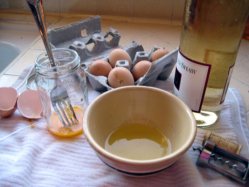
To make egg tempera base: Separate an egg, leaving the membrane around the yolk intact. Discard the white, or save it for cooking. To remove remaining egg white, gently wash the yolk under lukewarm water, or carefully pat with a paper towel. Now hold the intact yolk over an open wide-mouth jar, and puncture the membrane with a fork, letting the liquid pour out of the membrane. Discard membrane. Stir egg yolk in jar with a fork. Add 2 parts (for a large chicken egg, one part = one tablespoon) dry white wine, and stir again. Done!
If you don't have white wine, use 2 tablespoons water plus 1/3 teaspoon white household vinegar. The slight acidity of the wine or diluted vinegar helps emulsify the egg yolk and extends the life of the mix to as long as 7 days, if refrigerated between uses. Adjust quantity of liquid for a larger (duck, goose) or smaller egg.
Like other steps in the process of icon making, the acts of breaking and separating the egg, and of puncturing the yolk, are full of symbolism, which applies on both pagan and Christian levels. The egg, that ancient symbol of new life, is sacrificed for the life of the icon. The gold of the yolk evokes the life-giving sun. The hidden treasure inside the egg, never before seen by anyone but God, is suddenly revealed!
Egg yolk is the binder that holds the paint to the board. It will gradually cure and harden around the bits of ground pigment, forming a durable colored film. All the paint recipes below must start with egg tempera base!
Some General Principles
Colors and pigments follow a symbolic and artistic progression from dark and "earthy" for base colors to "spiritual" or "heavenly" for final layers - a logical system established back when iconographers had to find and grind their own pigments. Base layers are more coarsely ground, darker, less expensive pigments. The most beautiful, costly, and finely ground pigments are reserved for top floats and finishing touches.
The traditional palette depends largely on various naturally occurring colors of ochre (also spelled "ocher"), and other readily available earthy mineral pigments. Most of these dissolve easily, spread well on the board, are non-toxic, and are generally a pleasure to work with. Historic iconographers supplemented these earth tones with touches of white, black, and brighter colors, especially red. Blue was particularly rare and precious, used selectively for the most exalted subjects. The typically subdued and subtle icon colors set off gold leaf beautifully.
The base color, or roskrish, is dark and heavy, and typically contains some gritty pigment for texture and character. (Some pigments are so gritty that you may wish to grind them finer, even for roskrish.) It will also contain medium-ground filler pigment, and may optionally contain finely ground pigment as well. Visually, it forms the darkest shadows for each color.
Roskrish colors for garments and background should be somewhat diluted for a gently mottled effect, so that the white of the board shows slightly through the textured mix of pigments. Spread the wet paint in a puddle with a fairly full brush, using small (1/4 to 1/2 inch) circular brush strokes to distribute pigment as uniformly mottled as possible. I usually need 2 coats for garments, more for backgrounds. If 2 or more coats are used, they may be of slightly different colors for subtlety and vibrancy.
Sankir, the complex olive-drab dark base color mix for flesh and hair, should be somewhat smoother, a blend of medium-to-fine-ground pigments. Dilute with one or two drops of water, or not at all. Apply relatively opaque, but so that a hint of the white board shows through. I usually need 2 coats.
Colors for lines should be in the same or similar color family as their respective base colors, but 2 or 3 shades darker, to show easily against them. Do not dilute paint for lines.
Colors for the first, second, and third highlights contain white, and must be light enough to show against the base color. Tint the white with medium or finely ground pigment. They are usually (but not necessarily) a pastel version of their base color. Each highlight should contain slightly more white and yellow than the previous one. Highlights must be bright enough to retain their visual impact through the overlying floats.
Let highlights set up overnight or longer, before applying floats over them!
Colors for the first, second, and third floats are increasingly bright and pure, medium to fine grind, and most do not contain any white. They are usually brighter versions of the base color, to help restore depth and intensity after highlighting. After mixing with egg base and checking the color, dilute it with water for a light wash, nearly transparent. Apply with a larger (usually size 4 or 6), fairly wet brush, puddling in small circles - no long brush strokes. Your brush should barely touch the board. A little lake or puddle should form, which is why this technique is sometimes referred to by the French term "petit lac." Floats must be thin so as not to obscure the highlights.
Colors for final lines, lettering, details, borders, and highlights or ozhivki (ojivki) are bright and pure, and usually there is no reason to dilute them.
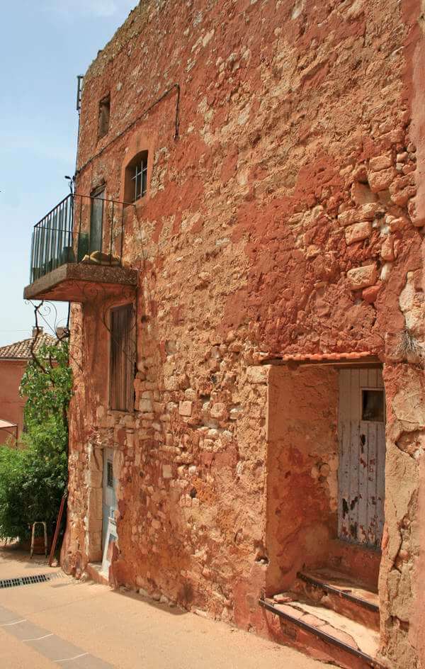
Iconographer Cheryl Hendrickson returned from her vacation in France with these pigments from the rose-red town of Rousillon, where the rocks can be ground into natural red and brown ochre pigments. The store shelves held other pigments too, such as the iridescent "nacre" white in the foreground, made of ground seashells.
Mixing Egg Tempera Paint
Mix paint in white porcelain or plastic watercolor palette. Use a tiny spoon or small pointed palette knife to transfer a small amount of each dry pigment in your color recipe to a palette cup. Using an eye dropper, add 2 or more drops of egg tempera base (see recipe at top of page) to the same palette cup. Stir with brush to form a paste; then add more egg tempera base if required for a cream-like consistency.
Add a few more drops of egg tempera base to the mix, and stir again. Test color on white paper or Bristol board, and adjust if necessary. You may then add a drop or two of water for a good flow and "feel" of the brush. If the paint starts to evaporate with use, add more egg base, not water. Mix only one color at a time.
Use paint full strength, or nearly so, for sankir at flesh and hair. Dilute other roskrish and background colors with distilled water, one to two parts paint to one part water. Test on lined white paper; some colors may look better if less diluted.
To blend paint at highlights on flesh and garments, make 3 mixtures of increasing strength, as follows. When you mix a highlight color, put 5 drops of water + 2 drops of egg tempera base into each of 2 cups adjacent to your cup of full-strength paint. Mix some color into one of these adjacent cups, for a dilute highlight color. Soften edges of full-strength highlights with dilute paint. Soften edges of dilute paint with the pure egg-and-water mix; no pigment.
Use full-strength highlight mix for hair, wings, "assiste" style highlights, and gold trim.
Mix floats very thin; 2 to 4 or even more parts water to one part egg tempera base. Test on lined paper to check coverage, which should be quite light and dilute, so as to tint but not obscure the highlights below. Better two or three light floats than one heavy float.
Use paint full strength for dark lines, lettering, narrow borders, details, etc.
Cleanup - Pigments are not biodegradable and can clog drains. Wipe out palette well before washing!
Testing New Pigments!
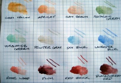
There are many pigments that do not appear in my recipes. If you buy new pigments, experiment to see how they will behave in egg tempera paint. Using lined paper, test new pigments full strength solid, dilute solid, and as lines.
This test shows the "Mineral Pigments" set from www.earthpigments.com. 9 of these pigments are quite transparent. Diluted, they should make beautiful floats! The 3 pigments at lower right cover well enough for line work and lettering.
All 12 pigments are finely ground. This group is slow to dissolve. Supplement them with coarse and medium ground pigments for base layers.
USEFUL BASIC COLOR MIXES - Pigments, mostly from Sinopia, are described on Supply List page.
Bright red mix or halo red mix, first color applied, for a line around the gilded halo: One part vermilion or Earth Pigments "Cinnabar," one part earth orange, one part Venetian red.
Sankir mix is the base color for flesh and hair; typically a dark olive drab, suitable for shadows on the olive skin tone of Biblical persons and others from the Mediterranean area. Mix 2 parts gold ochre, one part terra verte, one part burnt umber, 1/4 to 1/2 part bright red or earth orange. For saints with other skin colors, sankir color may vary from near-black or even blue-black for a very dark-skinned saint, to deep olive tan for a very light-skinned saint. Always include green. Mix it two or three shades darker than the shadows on the skin. Better too dark than too light.
Olive green mix: One to 2 parts gold ochre, one part terra verte, optionally 1/2 part orange ochre.
Black lines mix: One part burnt umber and one part shungite, a blue-black obtainable from Natural Pigments.(Black pigment is OK but some kinds are hard to dissolve.)
Dark red lines mix: One part Venetian red, one part red ochre, plus burnt umber or other dark pigment to taste. Mix it dark enough to show against base color. (Earth Pigments Natural Red is also good for dark red lines.)
Salmon pink/reddish tan highlight mix for flesh and hair: White, yellow (or gold) ochre, and red (earth orange, vermilion, bright red mix, Venetian red, or Earth Pigments Cinnabar). Mix for the first highlight should be predominantly red. Use this mix for highlighting flesh and hair - dark pink for the first highlight, more white and yellow for second and third highlight. The same recipe may optionally be used for highlighting brown, red, and red-violet garments. Mix in more white if needed for this highlight color to show up well on garments.
Ozhivki (ojivki) or Final Highlights: White with dark Indian yellow for flesh, hair, angel wings, gold trim and gold garments, orange or brown garments. White with lapis (azurite) or other light blue for red, green, blue, and violet garments. Many iconographers prefer to use ozhivki on flesh areas only, and not on garments.
THE RECIPES BELOW ARE GUIDELINES ONLY! Color mixes are quite flexible, especially for those dark roskrish colors, as long as you come out with an appropriate final color. Experiment with color mixes on your practice board.
Flesh
Base color or roskrish: Sankir mix
Dark lines for pupil and iris of eyes, upper eyelids, and eyebrows: Black mix
Dark lines for other flesh areas: Burnt umber or very dark red mix
First highlight: Salmon pink/reddish tan highlight mix; red (earth orange, cinnabar, vermilion, or Venetian red) plus yellow or gold ochre and a small amount of white. This color should provide a healthy glow for skin tones.
First float: Dark ochre
Second highlight: Same as first highlight, but with less red, more gold & white
Second float: Green ochre and/or gold ochre
Third highlight: Same as second highlight, but with less red, more gold & white
Third float: Gold ochre, optionally tinted with red
Re-drawing of lines for pupil and iris of eyes, upper eyelids, and eyebrows: Black mix or burnt umber
Re-drawing of lines for other flesh areas: Dark red mix
Ozhivki: White + dark Indian yellow
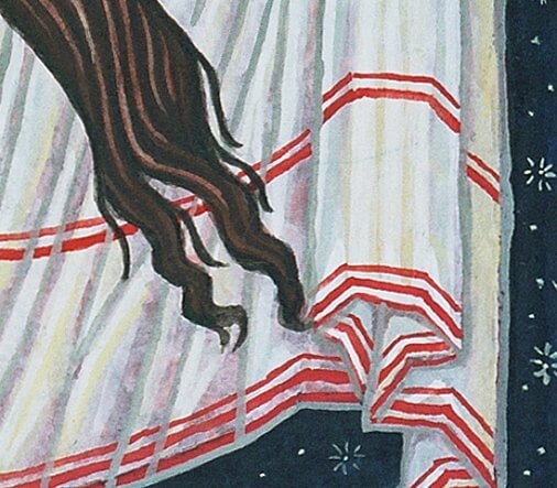
DIFFERENT SKIN AND HAIR TONES - the three heavenly beings in "Ubuntu Trinity" are depicted as androgynous persons of different racial ancestries. For each figure, a different sankir mix was used. Highlights and floats on flesh are the same for all three.
Similarly, each of their near-white garments has its own roskrish color, but highlights and floats are the same for all three garments.
Dark Brown Hair
For other hair colors, change the floats and 2nd-3rd highlights
Base color or roskrish: Sankir mix
Dark lines: Black mix
First highlight: Same as for flesh
First float: Burnt siena, with optional burnt umber
Second highlight: Same as for flesh
Second float: Brown ochre
Third highlight: Same as for flesh
Third float: Earth orange, brown ochre
Re-drawing of lines: Black mix
Ozhivki: White + dark Indian yellow
Facial hair is lighter than other hair. It should be floated with the rest of the face. You may float tips of beard with hair color, blended into face Touch up mustaches and beard tips lightly with burnt umber or black.
It was customary for men to start growing a beard at about age 30; so a long beard is an indicator of age. For older men, both regular and facial hair may be floated with the face for second and third floats. Older men will have more ozhivki in the hair and beard, and may have ozhivki in their bushy eyebrows.
As an adult, Jesus is shown with very dark hair. Third highlight is optional, and his hair has no ozhivki. In some icons, like the one shown here, his beard is represented by tiny strokes of burnt umber.
Animals in icons, especially furry or woolly animals, can be treated similarly to human hair, using a sankir base coat and adjusting the coloration with highlights and floats.
Exception: A very white horse, such as the one that Saint George rides, looks good with a creamy-white base coat and a slight highlight in brighter white. Similarly, a very black horse may be painted with black or off-black base coat and slight highlight.
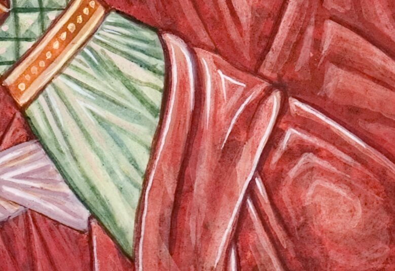
Red Garment
Base color or roskrish: Iron oxide texture pigment, light hematite or
Venetian red, earth orange or bright red mix
For a darker tone, add burnt umber and/or idanthren blue
Dark lines: Black mix or burnt umber
First highlight: White + red ochre; or same as flesh plus white
First float: Red ochre
Second highlight: White + red ochre & gold ochre; or same as flesh
Second float: Earth orange
Third highlight: Same as flesh
Third float: Vermilion, cinnabar, or other bright red
Re-drawing of lines: Dark red lines mix plus burnt umber
Ozhivki: White tinted to your taste
Optional: Illuminate shadows with lines of bright red
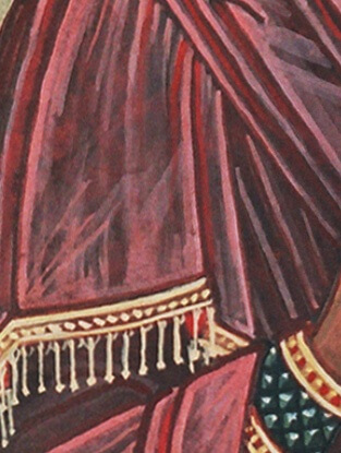
Dark Red-violet Garment
Base color or roskrish: Iron oxide texture pigment, dark hematite, burnt umber
For a darker tone, add a bit of idanthren blue or shungite
Dark lines: Black mix
First highlight: White + any dark red or violet; or same as flesh
First float: Burnt sienna + burnt umber; or other very dark red or violet
Mix extra, let pigment sink to the bottom, use only the top layer.
Second highlight: White + any dark red or violet; or same as flesh
Second float: Burnt sienna or other dark red
Third highlight: Same as flesh; or white + lapis (azurite) or any light blue
Third float: Burnt sienna
Re-drawing of lines: Dark hematite, burnt umber, colonial violet, or black mix
Ozhivki: White + lapis (azurite) or other light blue
Optional: Illuminate shadows with lines of bright red
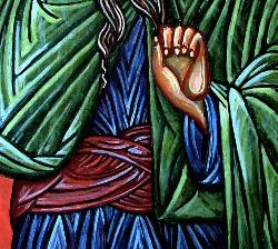
Blue Or Green Garment
Base color or roskrish: Maya blue or vivianite texture pigment, terra verte, brown ochre + small amount of idanthren blue
Dark lines: Black mix or burnt umber
First highlight: White + olive green
First float: Terra verte + dark Indian yellow
Second highlight: White + terra verte
Second float: Terra verte + tiny amount of idanthren blue
Optional other blue or green
Third highlight: White + olive green & dark Indian yellow
Third float: Lapis (lazurite) in 3 light floats, or other blue or green
Re-drawing of lines: Black mix or burnt umber
Ozhivki: White + lapis (azurite) or other light blue
Yellow Or Golden Garment; Golden Trim; Golden-brown Angel Wings
Base color or roskrish: Brown ochre, yellow ochre, earth orange
Darker roskrish for angel’s outer wings: Add a bit of burnt umber
Dark lines: Dark red mix
First highlight: White + gold ochre
First float: Orange ochre
Second highlight: White + gold ochre & dark Indian yellow
Second float: Yellow ochre
Third highlight: White + gold ochre & bright yellow
Third float: Gold ochre (same as flesh)
Re-drawing of lines: Dark red mix
Ozhivki: White + dark Indian yellow
Light Blue; Angel’s Hair Band And Inner Wings
Base color or roskrish: Any dark red or violet + white
First highlight: White + gold ochre
First float: White + vermilion (or white + cinnabar)
Second highlight: White + dark Indian yellow
Second float: White + lapis (azurite)
Re-drawing of lines: Olive green + white
Ozhivki: White
White Garment Or Napkin
Base color or roskrish: White + dark hematite or burnt umber
Dark lines: Green ochre
First highlight: White + gold ochre
First float: White + vermilion (or white + cinnabar)
Second highlight: White + gold ochre & bright Indian yellow
Second float: White
Third highlight: White or pastel(s) of your choice
Optional highlights and shadows: Pastel shades to taste
Re-drawing of lines: Olive green + white or other dark pastel color of your choice
Ozhivki: White, or white + lapis (lazurite) or other light blue
OTHER WHITES AND OFF-WHITES - Use various roskrish colors to produce whites with different tints or shadow tones. For a more golden-toned white, such as parchment scrolls and the pages of open books, use gold ochre rather than vermilion in the first float.
Dark Brown Or Monastic Garment
Base color or roskrish: Same as red-violet garment
Dark lines: Black mix
First highlight: White + olive green
First float: Burnt umber
Second highlight: White + any red; or same as flesh
Second float: Burnt sienna or other dark red
Third highlight: Any pastel green or blue
Third float: Burnt sienna
Re-drawing of lines: Black mix
Ozhivki: White tinted to your taste
STEEL BLUE; use with a limited palette
Caution; this color can be quite "heavy" and may clash with greens and blue-greens
Base color or roskrish: Shungite + a little white
Dark lines: Black mix
First highlight: Shungite + a little more white
First float: None
Second highlight: Same as first highlight + more white
Second Float: None
Third Highlight: Same as second highlight + more white
Third float: Lapis (azurite or lazurite, applied in 3 very light floats)
Re-drawing of lines: Black mix or shungite
Ozhivki: White + lapis (azurite) or other light blue
Red-orange To Receive Shell Gold
This paint should be smooth; no texture pigment!
Base color and all floats: Nearly full strength mix of orange, golden, and bright/light red pigments to taste. Vary the mix so that each color is slightly different from the one beneath.
First and second highlights: Optional, usually omitted.
Third highlight: Shell gold.
Third float: None.
Re-drawing of lines: Red lines mix plus burnt umber.
Background Colors
All sorts of colors can be used for backgrounds! In many historic icons, the background is gilded. Start with a muted mixture, and work up through succeeding layers to a brighter or darker color. Each layer should be a slightly different color from the layer under it, to achieve a subtle mottled effect. Apply the paint by puddling in little (1/4 inch) circles, with wet brush barely touching the board.
Dark Blue (Night Sky) Background
Base color or roskrish: Terra verte and shungite + a pinch of idanthren blue - careful with idanthren blue!
Succeeding floats: Same + optionally other dark blues
Top floats: Lapis (azurite or lazurite), applied in 3 very light floats
8-pointed stars: White + dark Indian yellow
Red Background
Base color or roskrish: Pale ochre, orange ochre, cream (texture)
Succeeding floats: Earth orange or other red-orange
Top floats: Vermilion or Earth Pigments Cinnabar
NEAR-BLACK for interior of caves
Base color and all floats: Burnt umber mixed or layered with other darks such as shungite or dark hematite, Vary the mix so that each layer is slightly different from the layer beneath. Sometimes a warmer tone such as dark brown or dark red-violet is used for caves.
A color chart from a workshop of the Prosopon School.
Color symbolism follows a chakra-like system. Blue and violet are associated with heaven, and red with earth.
Green, in the center, symbolizes the desired balance in our human lives. This is why sankir, the base color for human flesh and hair, always contains some green.
For additional theoretical material from the Prosopon School, see bottom of Article page.
