Let your roskrish layer set up at least overnight, and preferably longer, before you start your highlights! Do not overwork the blending. It is better to blend a bit unevenly, than to scrub off the roskrish by attempting to blend highlights perfectly.
As you progress through the highlights and floats, finish each step on all areas, before moving on to the next. "Working ahead" can throw the icon out of balance.
Miniaturization: For icons where faces are smaller than a dime (17mm), two highlights and floats may be enough to delineate the faces and hands. You can usually omit final lines on nose and lips. Garments will usually need 3 highlights.
THE LIGHT OF AN ICON seems to come both from within the holy person in heaven, and from outside it. As you work on the layers of highlights, consider the meaning and function of each, as well as the shadows which help delineate and sculpt the figure.
You will be bringing light out of darkness and retracing the beautiful stories of God's creation and the drama of salvation, both symbolically and artistically. The making of an icon re-enacts our human journey from deepest origins in ancient and mysterious darkness, towards our ultimate destination in God's shining community of heaven. Iconography becomes an act of devotional service to God and to all humanity.
The completed icon should glow, not only with the many lights of creation, but with the “uncreated light” of God within, the light which showed itself in Jesus at the Transfiguration.
FIRST HIGHLIGHT gives some solidity to the figure, grounding it in the material universe.
SECOND and THIRD HIGHLIGHTS proceed into intellectual and spiritual dimensions, represented by sparkling crystalline and cubist effects.
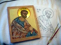
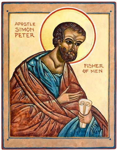
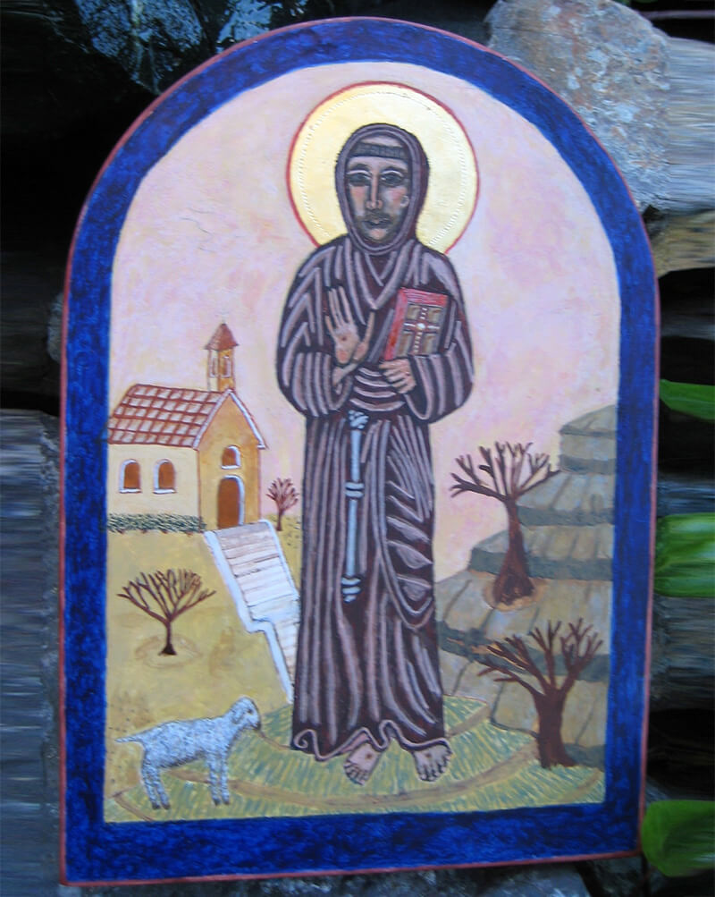
Saint Peter with first highlight, and finished icon. To liven up Saint Peter's brown robe, the first and second highlights are pink (same as flesh) and the third highlight is pastel yellow-green (same as blue robe).
FIRST HIGHLIGHT is under-painting, representing the "light of nature" or the “cosmic highlight,” indicating the natural light of the universe, and bringing order to the Chaos. It is relatively naturalistic, coming from in front, slightly above and to one side. The first highlight reveals the basic sculptural shape of the figure, and serves as supportive under-painting for the smaller and livelier second and third highlights to follow.
The first highlight should cover approximately 2/3 of the figure. To make the first highlight bright enough and smooth enough, I usually apply two, three, or more coats of first highlight, letting it dry and set up a bit between coats, while I work on highlighting a different area. Each highlight color must contain enough white to stand out from its roskrish and show through several subsequent layers or "floats" of dilute paint.
The nearer to the viewer, the more strongly that part is highlighted. Do not lose your lines or shadows! Shadows help define the figure, and enhance the viewer's sense of mystery. Strong shadows should remain in the eye sockets, under the mouth, under the chin, and on edges of hair and garments. Highlights fade out toward the bottom of the icon. The figure should stand out strongly against its background, so leave the edges of the figure dark, without highlights. Keep your strongest highlights toward the center of face, body, and arms.
Work for precision, but don’t be compulsive, because there are many layers ahead. When completed, the first highlight may look awkward and crude! Don’t be discouraged; you’re just roughing out the shape of the figure. If your highlight has spread excessively, paint and blend shadows back in with your roskrish or a similar dark color.
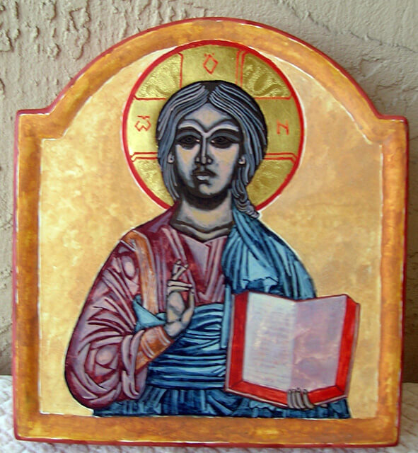
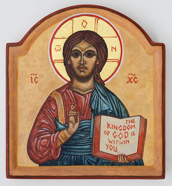
First highlight on a small icon of Christ the Teacher; and the finished icon.
The first highlight establishes basic volumes and bright areas. Note the dark margin of the figure, without highlights. First highlight in flesh areas should be a darker, redder pink.
In the later highlights, the figure will become much more detailed and refined. Floats will brighten the colors, and skin tones will gradually become more lifelike.
First highlight on the face, throat, and other flesh areas should be rosy and only slightly lighter than sankir: In your watercolor palette, mix 3 little cups of paint. Make full-strength bright dark salmon pink mix (1 part or less of white, 2 parts yellow ochre or gold ochre, 3 parts bright red or red-orange of your choice), a diluted version of the same salmon pink mix in 2 drops of egg base and 5 drops water, and clear untinted mix of 2 drops egg base with 5 drops water. You can now blend full-strength paint into dilute paint, and dilute paint into clear mix, for gradual shading. Practice this blending and shading on paper.
Start with the eye area, being careful to keep highlights symmetrical. Paint a bright spot at the inner corner of each eye; then a bright eyelid line just above the black line of the upper eyelashes. Optionally, paint a dilute crescent-shaped highlight in the area between upper eyelid and eyebrow.
Paint bright edges on the upper cheeks, neatly delineating the shadows under the eyes. (Older saints and grieving saints may have a dark trace of tears, running down the cheek from the eyes.) Using dilute paint, blend wet paint out onto the cheek. Continue dilute paint down the center of the cheeks, out towards a rounded outside edge, and down into the complex shapes of the lower face. Blend in at outer edge with clear mix. This process is like applying makeup to your own face! For a large face, you may paint and blend with a sponge-tipped eye shadow applicator rather than a brush. One side of the face should be noticeably brighter than the other. Leave edges dark.
Paint bright lines on the brow ridges, and blend up. Paint a bright spot high on the forehead, and blend out. Paint a bright triangle or V-shape at the top of the nose; then a bright line down the shaft of the nose, a bright oval at the tip of the nose, and a smaller bright spot on each nostril. Highlight the lower lip, which is only half the length of the shadowed upper lip. Paint a small bright spot on the chin, and blend out. Highlight a hook shape on each ear lobe.
Paint the bright edge of the shadow under the jaw, then blend down and outward onto the throat. This highlight will extend up toward the ear, but its brightest spot is in the center. Paint the bright edge of the collar bone, fading out at the ends. Paint a bright spot under the collar bone on each side. Blend out and down. Leave edges dark.
Hands carry the gesture and intent of the holy figure. They should be slender and gracefully formed, and may be quite stylized. In historic icons, you will see a variety of highlighting styles for hands. Paint a bright spot on each fingernail; then a bright line at the cuticle under the fingernail. Now paint the lines of the fingers; then out into the hands and wrists. There will be several bright spots, such as the wrist bone and the heel of the thumb. Blend these in where possible. Feet and other flesh areas are highlighted similarly.
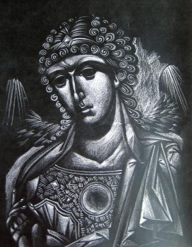
At right, from Dmitri Andrejev, is a study in white pencil on black paper, showing first and second highlights for an angel. If you have not highlighted a face before, trace or xerox your drawing onto dark paper, and practice highlights for your icon with white paint or white pencil.
The lights and shadows form a rhythmic unity, spiraling about the face and down onto the throat and clothing. The shadow under the brows flows smoothly, in a continuous curve, into the shadow under the jaw line.
Similarly, the light on the nearer cheek curves smoothly down from cheekbone to chin. The complex shape of this highlight is worthy of close study. Note that it comes in toward the upper lip, then just to the corner of the lower lip, and ends up in a bright spot on the chin. At its outer edge, it blends gradually into shadow.
The light on the farther cheek is much simpler, a long curved triangle extending down from the eye.
Note especially the shape and highlighting of the mouth. The upper lip remains in shadow, while the lower lip is strongly highlighted. The lower lip is only about half the length of the upper lip. A small but carefully shaped shadow remains under the lower lip.
First highlight on hair and (optionally) beard is full strength, the same color as flesh. Use your smallest brush to paint bright lines or pairs of lines between previously-painted black lines. This is fun, all the parallel waves and double spirals, bringing out the energy of the holy figure! Each curl should have a bright spot in the center.
First highlight on gold trim is full strength light gold, just edges and primary shapes. (Painting of details will follow in second and third highlights.)
First highlight on angel wings is full strength. Paint edges of larger feathers under the dark line, and small rays of light shining out from under the feathers. At the top of the wing, paint a small bright oval or “well” of light. Now paint lines radiating out from this point, in sets of 3 or 4 parallel lines. On inner wings, paint the bright edges of a few tiny feathers.
First highlight on garments will require both full-strength and dilute paint. Leave the outside edge of the figure in shadow, so it will stand out against the background. Toward the bottom of the figure, highlights will fade out. Use only dilute highlights, or none at all, in areas to receive final details – such as the area behind the golden fringes that often adorn Mary’s shawl.
Typical garments for icon figures consist of a loose long-sleeved tunic, sometimes gathered into an ornamented or quilted neck band and cuffs, plus an outer wrap or cloak of contrasting color. The outer garment is a long rectangle, first anchored around the waist for a cummerbund-like effect, then wrapped over and around the left shoulder, around the waist a second time, and up over the left shoulder again, to end in a graceful drape. It covers the left arm, and may cover the right shoulder and all or part of the right arm. Like a modern sari, it can be wrapped and draped in a variety of fashions. The waist wrap may optionally be shown as a separate piece of cloth, in a third color.
In pre-industrial times, cloth was precious! Garments had to be woven and then sewn by hand, from hand-spun yarn, from home-grown flax or the wool of one’s own sheep. Dye was expensive, so brightly colored clothing was doubly valued. The artists of ancient and medieval times gave passionate attention to rendering the folds, billows, and shadows that appear in loosely draped woven cloth.
Pay attention to the structures of folds and shadows that appear in your own clothes. Put on a large shawl or a soft throw, and look in a mirror to observe its folds, shadows, and highlights. Notice that the inner folds appear as dark lines, surrounded by brighter lines in higher areas. You may notice smaller ridges and valleys stretching diagonally between principal folds, on the bias of the weave. In an icon, these physical structures become expressively stylized.
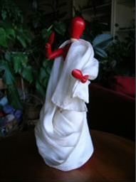
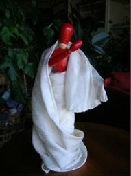
Keep in mind the body under the garments, and the way that loose cloth falls and moves over and around the body's shapes. Get an adjustable doll or wooden art figure and drape it in soft solid color cloth, preferably woven rather than knit. Look at photographs and at historic icons for other models.
For first highlight, use full strength paint to make a bright line following around the outside of each set of the spiral branching dark lines which represent deep folds. Leave a small gap between dark line and highlight. At the end of a dark line, hook the bright line around, back into the next point where 2 dark lines branch out. Try to make these points sharp. Now fill in the triangular area between branches, using dilute paint.
Also highlight the collar, near the face. Highlight sleeves and cuffs, since they are nearest the viewer. Highlight shoulders, elbows, and knees with a bright spot, blended out, and surrounded by a small spiraling set of folds. Highlight cascades and billows of cloth, including the tiny sparkling points at the bottom of their folds. If certain areas seem to need additional visual interest, add more folds and highlights, echoing and paralleling those previously painted. These highlights should have a rhythmic quality, and some motifs or patterns may repeat.
At diamond quilting, highlight the top half of each diamond-shaped segment.
FIRST FLOAT: After the first highlight has set up overnight or longer, mix paint for "floats" which are very light washes of intense color. The highlights glow through the float colors, and the roskrish gains depth and subtlety.
After mixing pigment and egg tempera base to the desired color, dilute it with distilled water and a bit more egg tempera base. Test on white paper with lines. The color should be very pale and transparent. Two or even three light floats are much preferable to one heavy float.
With a medium-size soft round brush, apply a float to each color area, right over the entire roskrish and lines and first highlights. Keep the brush wet, hold it at an angle, and move it lightly in little circles, barely touching the surface of the icon. Work with the surface tension of the wet paint to form a shallow puddle of float paint on each area. To avoid leaking between colors, let each color dry before working on adjacent areas. When first coat is dry, apply a second coat if needed.
Also float the background color, using diluted paint, in a tone slightly different from the color under it. A series of diluted floats of varied harmonious colors makes for a lovely opal background effect.
SECOND HIGHLIGHT: A smaller second highlight is a second layer of under-painting. It represents the Anthropos, the enlivening light of human intellect and culture. On the garments, second highlight provides a sense of dynamic tension, as though the saint has just moved and may soon move again.
The second highlight should cover only about a third of the area. For flesh areas, second highlight blends into and strengthens the first highlight. Mix with more yellow and white than first highlight; a medium salmon pink. Once again, mix 3 palette cups for blending: full strength, dilute, and plain egg and water. Highlight the brightest areas of first highlight, especially at top of cheekbones, and blend in at the edges, but leave the edges of the pinker first highlight untouched, providing a rosy glow to skin tones. Do not highlight inside eye socket.
On hair, use full strength paint on a fine brush to highlight only parts of the strands and curls nearest the face, and a small dot in the center of each curl. Do not highlight hair at the edge near the halo.
On gold trim and brocade, use full strength paint on a fine brush to start adding texture and detail.
On draped clothing, the second highlight takes the form of a stylized and spiritualized rendition of the small wrinkles and bias folds that occur in draped cloth, as radiating lines, small triangles and parallelograms, and other small pointy angular shapes. It cuts diagonally across the first highlight, often as a series of parallel lines, trapezoids, and triangles, all producing crystalline cubist-like effects; and suggesting that the saint inhabits a spiritual dimension. Work for increased precision and detail. Divide some first highlight areas into two or more second highlights. Add small, dilute highlights to selected shadow areas. Use a fine brush to sharpen up the lines and the little corners of the first highlight. Now the garments start to sparkle, move, and flow!
Second and third highlights have a logical structure, direction, and rhythm. Like crests of waves moving across the water, like a field of grain in the wind, their flow of energy proceeds down the line of the body and its garments, synchronized but never repeating exactly. Check out those historic icons; also the icons in the Prosopon School gallery. Sometimes the garment highlights will have more than one direction, suggesting cross currents.
Larger first highlights may be subdivided into two or more angular second highlights. Although the second highlight should be brighter than the first, it does not necessarily have to be a similar color. It need not stay within the boundaries of the first highlight; but should not cross the dark lines. Again, leave a dark strip at the edge of the figure, without highlights.
Consider what textile you are painting. For most saints and apostles, the typical fabric is linen, highlighted as described here. Wool, such as the dark wool of Mary's outer garment, absorbs more light - and may optionally be painted with only a first, or first and second, highlight. On a soft fabric, highlights will be more blended and farther from the crease lines. Silk and gold trim are highly reflective and should receive plenty of tiny bright highlights.
On gold brocade and trim, paint ornamental patterns. For an all-over brocade pattern, try tiny leaves or flowers or spirals, and then fill in between them with little circles and dots. For braid trim, I often use a row of small bright dots.
On diamond quilting, highlight half of the previously highlighted half; one-quarter of each diamond segment.
On angel wings, pick out a few of the first highlights to emphasize. Brighten up the top of the wings, and some of the light that shines out from under the feathers.
SECOND FLOAT: Let second hightlight set up overnight or longer, The second float, in a brighter and purer tone than the first, softens the highlights on flesh, hair, and garments. Once again, float the background in a color slightly different from the colors beneath.
At left, from Dmitri Andrejev, is a study in light-colored and white paint on dark gray paper, showing stylized first and second highlights on cloth draped over a shoulder and arm.
Just as with facial highlights, note the location and flow of bright areas and shadows. The shadows are just as important as highlights in "sculpting" the figure and its elegantly draped garments. Highlights and shadows should be executed with equal care and precision.
The shoulder, collar, and forearm are "hot spots" which receive the brightest highlighting. Shadows remain along the lines and to the rear of the arm and shoulder.
The edge of the sleeve turns back to form a cuff, home to a strong triangular highlight. The collar fold is highlighted to help draw attention to the saint's face.
On the shoulder and forearm, note that secondary spiraling wrinkles were added as part of the second highlight. There were no lines here on the original drawing, but these second highlights follow imaginary lines that echo the lines on the initial drawing, which were originally engraved and painted to guide the first highlight.
THIRD HIGHLIGHT: A third highlight symbolizes the Theocosm, the spiritual or angelic light. It is much smaller than previous highlights, reinforcing and embellishing them. With the third highlight, the icon gains noticeable clarity and sparkle. Emphasize the gesture, line, energy, and movement of the figure. Use a small brush, keeping it fairly dry, for these tiny precise shapes and fine lines.
On clothing, you will see the third highlight bouncing and skittering down the folds of cloth in a syncopated rhythm. Again, emphasize areas nearest the face, and areas (such as sleeves) nearest the viewer. And once again, leave a non-highlighted strip around the edge of the figure. The third highlight may be a different color from the second. Keep it small, intense, and pointy or linear. Look at historic icons; some third highlights will surprise you!
Third (or sometimes second) highlight bright lines on clothing may extend to end in a dot, or a series of three dots. Use this lively highlighting technique with discretion; no more than twice per figure.
On gold brocade and trim, use your tiniest brush to pick out some of those exquisite small details. This Byzantine fashion design can be fun! Add a spot of brightness to each jewel and to each segment of diamond quilting.
On flesh areas, highlight only the closest and most important features - small bright areas at the top of the cheeks under the eye sockets, brow ridges, center of forehead, bottom of ear lobe. Highlight the nose in 3 separate parts - the triangle or "V" shape at the top, a line down the center shaft, a bright bulb at the bottom. Highlight the brightest parts of the throat and hands similarly. Blend edges, leaving soft edges of first and second highlights untouched.
On angel wings, use that tiny brush to emphasize a few of the most important highlights.
Third highlights on hair are usually closest to the face. Pick the center spiral of your favorite curls and the inner edges of your favorite waves. If you are painting adult Jesus, his hair should not necessarily receive a third highlight.
Consider what textile you are painting. For most saints and apostles, the typical fabric is linen, highlighted as described here. Wool, such as the dark wool of Mary's outer garment, absorbs more light - and may optionally be painted with only a first, or first and second, highlight. On a soft fabric, highlights will be more blended and farther from the crease lines. Silk and gold trim are highly reflective and should receive plenty of tiny bright highlights.
On gold brocade and trim, paint ornamental patterns. For an all-over brocade pattern, try tiny leaves or flowers or spirals, and then fill in between them with little circles and dots. For braid trim, I often use a row of small bright dots.
On diamond quilting, highlight half of the previously highlighted half; one-quarter of each diamond segment.
On angel wings, pick out a few of the first highlights to emphasize. Brighten up the top of the wings, and some of the light that shines out from under the feathers.
SECOND FLOAT: Let second hightlight set up overnight or longer, The second float, in a brighter and purer tone than the first, softens the highlights on flesh, hair, and garments. Once again, float the background in a color slightly different from the colors beneath.
Highlighting By Vladislav Andrejev
It takes many years of practice to attain this degree of mastery!
Vladislav's work is distinguished by his highly developed, facet-like second highlights on the garments. Like gazing into the depths of a crystal, they suggest the presence of other dimensions.
For more work by Vladislav Andrejev, see the Gallery at www.prosoponschool.com
"Assiste" Or "Assist" Highlighting
Upper right; demonstration by Nikita Andrejev on a student icon, highlighting the dish in which the severed head of John the Baptist reposes. This highlight will later receive a float of dilute reddish gold.
Lower right; painted assiste highlights on the golden robe of the Christ Child. It is used to give an impression of his radiant garment of brilliant light. Strongest emphasis is on the collar, shoulder, cuffs, knees, and folds around ankles. This icon needed to be brightened up, so this highlight did not receive a float.
On some icons, you will see highlighting applied as a series of bright rays emanating from small bright areas, rather than blended. This technique is known as "assiste." The rays indicate divine energy and the uncreated light of God.
Assiste is used for third highlight with shell gold or with gold leaf applied over glue, but may be applied with paint as the second or third highlight. Earlier highlights are usually omitted, so the assiste contrasts strongly with the bright or dark color underneath.
This is among the usual methods for highlighting angel wings. It is often used for garments of Christ Emmanuel, the Christ Child, and Christ as Risen Lord; for the golden trim on Mary's outer garment; and sometimes for golden trim or garments of other saints. It is not used on flesh. Assiste is appropriate for sacred objects such as gospel books and other objects held by a saint.
The background for assiste highlights should be intense enough to provide a good contrast. A smooth background (without texture pigments) is easiest to work on.
THIRD FLOAT: Let third highlight set up overnight or longer. Apply the third float, using brightest and purest pigments, mixed more dilute than first and second floats. Apply lightly for two or even three applications. The surface vibrates with subtly shifting colors.
Check skin tones. Unless your saint is depicted in the throes of grief or martyrdom, go for a healthy and even slightly ruddy look, just short of a blush. If the skin looks sallow, pallid, or yellowish, apply a light float of bright red such as cinnabar, vermilion, or earth orange to the edges of flesh highlights where they blend into shadow, and especially to hollows under cheekbones. If necessary for additional rosiness, give all flesh areas (including hands and throat as well as face) a light float of bright red. Tone down an excessive blush with a light float of gold ochre.
Optional: An angel or a healthy young saint may benefit from a stroke of orange-colored glow under the edge of the chin, as used on the famous icon of Archangel Gabriel from Saint Catherine's Monastery in Sinai.
Check shadows. Eye sockets and the "bags" under the eyes should be mostly in shadow, down to the highlight on the top of the cheekbone. You should have well-defined shadows along and under the nose, under the lower lip, along the hairline, and on the throat under the chin. If they got lost, paint and blend them back in with dark ochre.
REPAINTING OF LINES: Using your pattern drawing as reference, repaint the lines with a fine brush, in a darker color to complement the color of each area. Use black lines for eyebrows, upper eyelids, and pupils of the eyes, and for the lines around the iris. All other flesh lines are dark red. Hair lines are usually black, but beard lines should be lighter, burnt umber or brown ochre. Lines will cover up messy edges and may be used to refine the initial drawing.
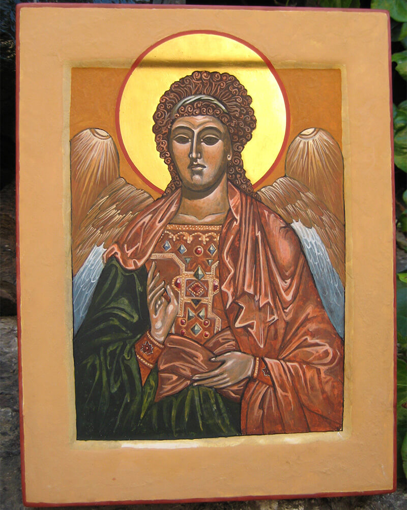
Third highlight on Lori Greenleaf's icon of Archangel Michael is almost complete. The green garment still needs its third highlight. The lower face is somewhat over-highlighted but can be easily toned down with a float of dark ochre or Venetian red at the edge. Hair, wings, red garment, hands, and gold trim are nicely highlighted and easy to "read" at a distance.
Highlighting on garments. Note spiraling treatment of folds, especially around high points near knees and at forearms. Also note the many little pleats, billows, and cascades of cloth.
Garments have a definite structure as they drape over the body beneath. Although highlighting of garments permits considerable flexibility in artistic judgment, it is not arbitrary.
Your icon is now ready for its Finishing Touches and its Inscriptions
Back to Roskrish or Base Colors
Back to Color Recipes


